Progetto Comenius Istituto De Nicola
domenica 12 luglio 2015
lunedì 6 luglio 2015
Misleading advertisements and the best pictograms for us
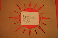
You can see what we have decided to produce. 2 misleading advertisements on milk: one which should contain the information of origin and gender (skim or whole). We made a slogan that can convince people that drinking our milk makes you lose weight and feel lighter because it reduces swelling, the second that would like to convince people that drinking milk the muscles will be better.
Pictograms: what do you think?
You can see what we made in the days before a lesson in our class with an expert in advertising Mr. Piergiorgio Venturini of TENDER ADVERTISING Abano Terme: we had already made the "pictograms" on specific issues but they did not seem to be such. After his explanation we understood that:
- They are simple signs, a synthesis of the product that you want to show;
- They are never represented with inscriptions;
- They are not very colorful;
- They are universal.
- They are universal.
For example, to represent Coca Cola three simple features are enough: the color red, the shape of the bottle and the white line in the red background.
martedì 9 giugno 2015
giovedì 4 giugno 2015
martedì 12 maggio 2015
At PASTICCERIA VENETA (www.pasticceriaveneta.it)
to improve the knowledge of the barcode:
thanks Mr Bisca and dr.Eva Giollo!!!!
Iscriviti a:
Commenti (Atom)


